In this guide, I show you how to choose who to pitch, how to find the right contact information, and how to craft a winning pitch.
PITCHING TO BRANDS AND IS THE BEST WAY TO GET YOUR IDEAL CLIENTS, AND YOU CAN DO IT WITHOUT FEELING ICKY
Gimme the Guide!
11 FOOD PHOTOGRAPHY DOCUMENTS EXPLAINED
Top Posts
11 PLACES TO SOURCE AFFORDABLE PHOTOGRAPHY PROPS AND BACKDROPS
30+ FOOD STYLING TIPS TO ELEVATE YOUR FOOD PHOTOGRAPHY
Free Resource
About Frenchly
I am a food + product photographer & educator specializing in eco-friendly and sustainable brands. When I am not working with clients, I empower creatives to start their journey by sharing my knowledge on the business of food + product photography.
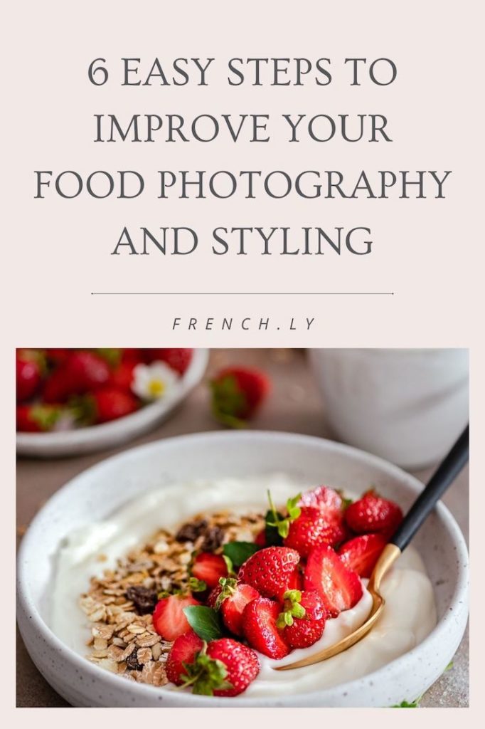
6 Easy Steps to Improve Your Food Photography and Styling
February 25, 2020
Please note – some of these are affiliate links, which means I’ll make a small portion of the profit if you purchase something, at no extra cost to you! Thanks for supporting us!
Food photography styling is about so much more than just the lighting or the recipe! Those are both super important, don’t get me wrong, but the key to captivating, tummy-rumblingly good images can be summed up in two words: visual storytelling.
For most people, their relationship with food is all tied up in experiences and memories. A good food story is just irresistible! That’s why you’re going to see a huge difference in your photography and styling after reading and practicing these 6 easy steps.
1. Start with the dish, itself
Think about your hero food. How can you use it in a way that speaks to current trends while still bringing out something completely new and different? Plan how you will convey tastes, smells, and textures in a flat, unscented image. Write down specific things that need to be highlighted about your food or recipe, so you can incorporate them into your thumbnail sketches. The hero food is the hero, after all, so always start there!
2. Then, the food needs a mood
It’s super, super, super important to think long and hard about the tone of your visual story before you start to tell it. Are you using chocolate-dipped strawberries to evoke romance or baking bright, sprinkle-covered sugar cookies with the kiddos? With both of those scenarios, you probably were able to instantly form a picture in your mind that involved specific colors, lighting, and maybe even a location.
Now you’ve got your starting point for your food photography styling! You can start brainstorming the lighting (and therefore, shadows), props, and color scheme based on just that first gut response. As you go deeper into the planning phase, a clearer direction will emerge.

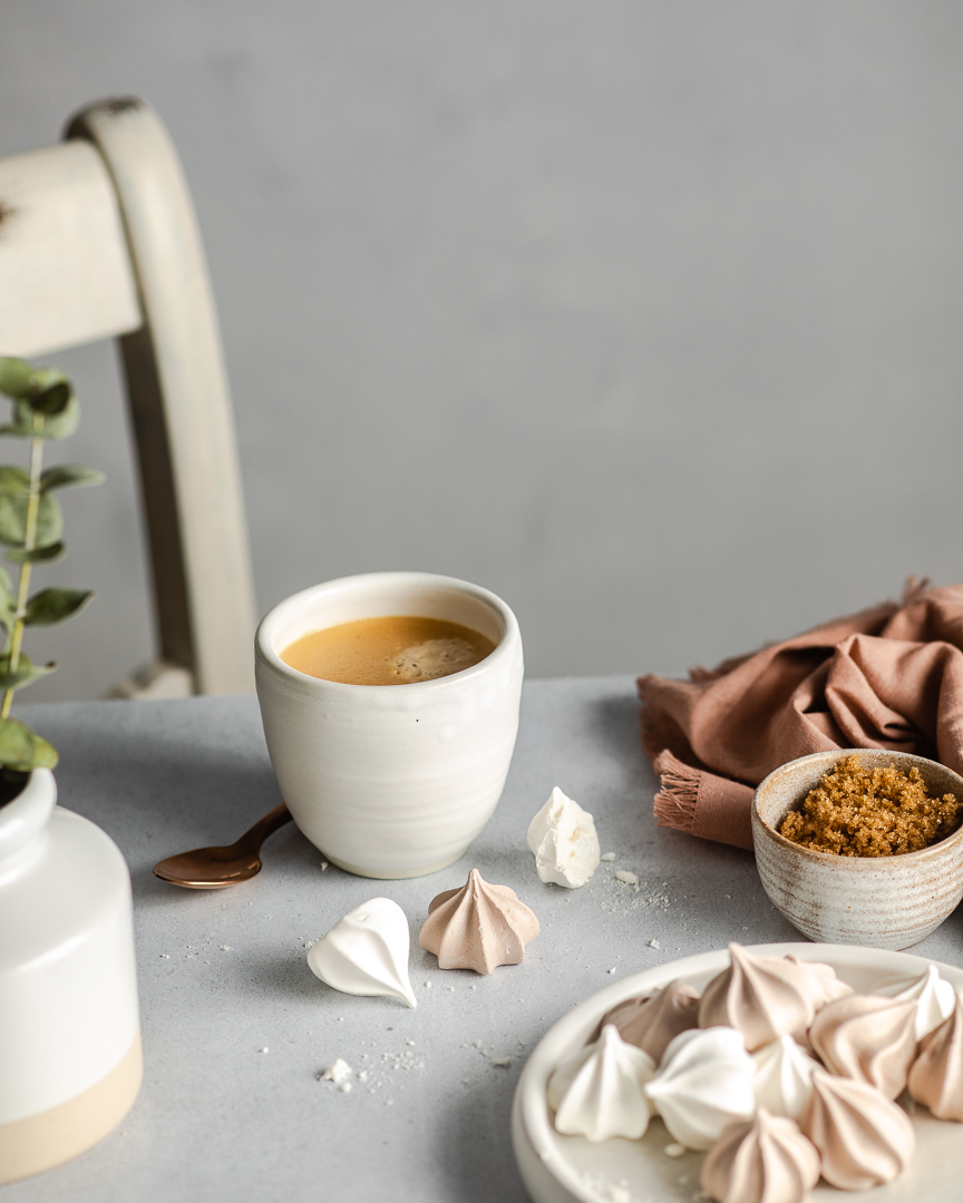
As I am trying to slow down and be more intentional about my work, I wanted to create a peaceful scene of a coffee break with these cute little meringues…
3. Form the narrative your food photography styling will tell
Think of all the steps food can involve:
- Choosing ingredients
- Prep {Kneading dough maybe, or mixing a buttercream frosting to smooth perfection.}
- Actually cooking and/or baking
- Plating the recipe
- Setting it out {Cookies probably belong on the counter; a sizzling roast chicken goes to the very center of the family table.}
- Eating and/or drinking it {My favorite part!!!}
- The aftermath, aka cleanup time {I don’t often shoot this phase but check out what Christall did with it below}
View this post on InstagramA post shared by Christall Lowe✖️Food Stories (@christall.lowe) on
There’s a ton of room for interpretation there! That’s why the food itself is never enough to carry an entire image. You’ll need to determine which part of this process speaks clearly to the mood you’ve chosen.
Keep that in mind, and in the next blog post, we’ll explore how we can use all these steps to create completely different images from a single recipe.
4. Find the right positioning for your shot
The angle you shoot from will impact how light works with your food styling, how the scale of different elements appear within it, and how your viewers feel when they look at it. That’s why I find thumbnail sketches to be so useful; I’m able to think critically about these things before everything is set out.
This step is a trial-and-error minefield, but I’ve got some rules of thumb to keep in mind:
Layer!
Photos are already flat by nature, so you’re going to have to work double-time to combat that. Put silverware in your soup bowl, drape napkins across all the things, and scatter ingredients around to simulate dimension. {I have many more examples in my collection of 30+ styling tips.}
…but don’t block your main dish.
It seems obvious, but as you start looking at the composition as a whole, you may find that your hero is getting hidden. That’s no good! Before you take out the stand-in food and start clicking the shutter button, check one last time that your hero is still the hero. also make sure that your hero is indeed beautiful! Sometimes, we spend so much time with the styling of the scene, that we overlook the styling of the dish itself!

You will likely spend a lot of time styling the scene, but don’t forget to take a good look at you hero to make sure the styling there is spot on!!
Look for ways to create implied leading lines.
Think of leading lines as if they were little breadcrumbs scattered throughout your image. They lead the viewer’s eye in a direction that keeps them engaged as they experience the different elements within your food styling. You can do this by shaping your napkin strategically, stacking elements, or carefully placing your silverware.
When in doubt, follow the Rule of Thirds.
You know, the one that says to place your subject across 1/3 or 2/3 of your image? It really is an instantaneous way to add a little extra something to your composition. CreativeLive has some great classes on this. When you mentally divide your image into thirds horizontally and vertically, you get a series of points where they cross that are prime real estate for your hero food to hang out and get maximum exposure. {You don’t have to do this in your head! Most cameras have a setting to put a thirds overlay across your viewfinder as you shoot.}
5. Pull out all the stops
And not just f-stops — little photography joke for you there 😋
There are lots of tips and tricks that photographers use in food styling to make our tools and visual elements cooperate. You’ll learn many of them along the way, but some of my favorites are:
- Using makeup wedges to prop crooked elements into a straighter position
- Warming wet cotton balls to simulate steam behind a not-so-hot-anymore dish
- Putting an upside-down bowl on my plate to make appetizing mounds of pasta
- Using black foam core to target my lighting across the hero food (This is also a great dark background in a pinch!)
- Bouncing light exactly where it belongs with white foam core
- Using fake ice cubes at the bottom of my smoothie bowls so that ingredients can be styled on top without sinking
6. Have a food styling kit ready to go
There are a lot of miscellaneous items that you will need frequently as a food photographer. Since I have a home studio, most of my kit stays there for me to use each time. However, I do occasionally shoot on location, so I keep the essentials grouped together for easy access. As you build your kit {it may take some time, and that’s okay} be on the lookout for these odds and ends:
Fake ice:
From using it as actual fake ice, to filler in soup bowls and garnish proper in smoothie bowls, they have many uses!
A spray bottle:
To get tantalizing droplets on my fresh produce and drinks.
Tweezers:
For making tiny changes without moving everything out of place.
Sticky tack:
To make stubborn elements with rounded edges stay put — no rolling on my watch!
Windex wipes:
For getting a nice sheen on reflective surfaces, especially when I’m shooting on location.
Coins:
These help to mark my spot after I remove the stand-in food. That way the fresh stuff goes in fast and photographs better.
Small baggies of things to scatter:
I don’t know about you, but when I cook, things get everywhere. I love to recreate that look in my photos, so I always have a little bit of flour, some cupcake sprinkles, and/or breadcrumbs to scatter.
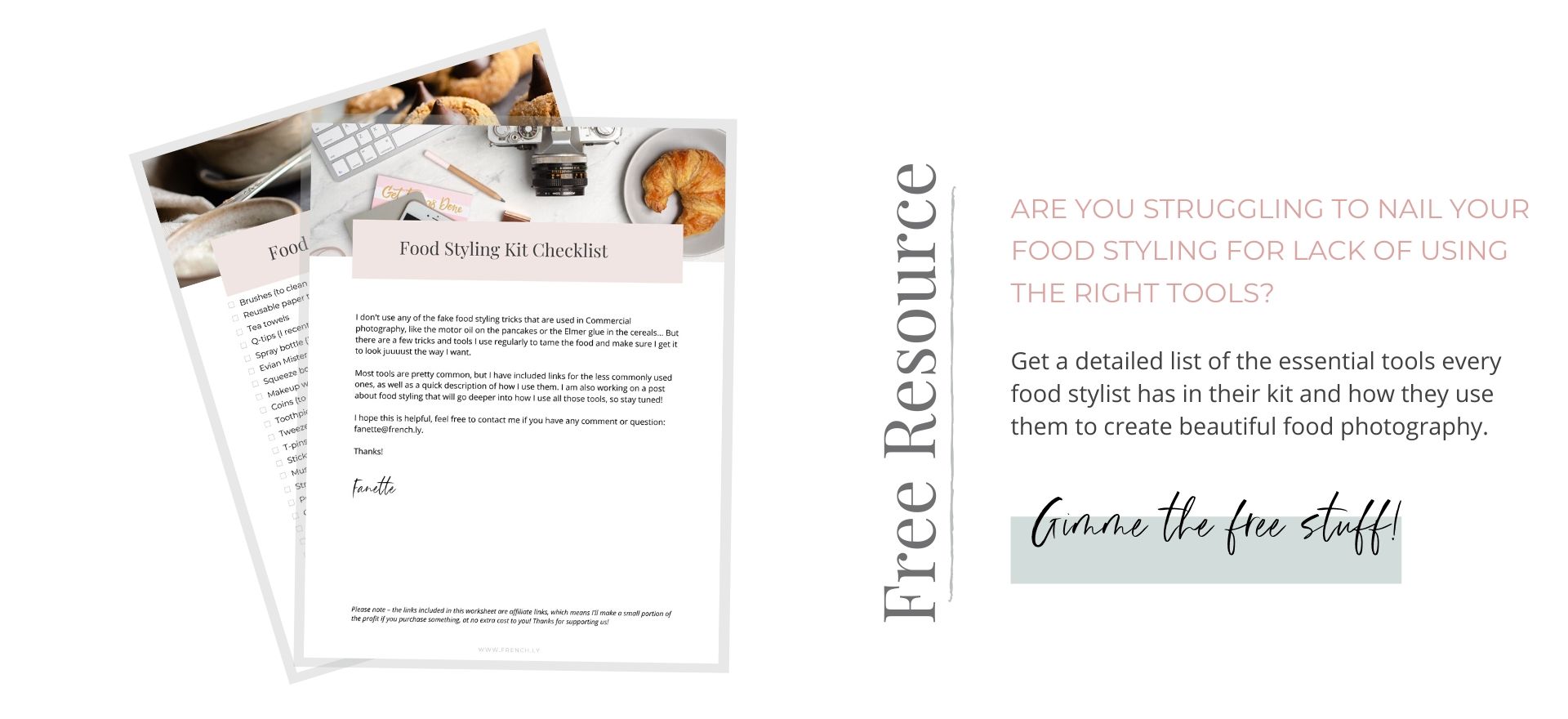
For a complete list of my food styling kit must-haves, get my food styling kit checklist!
Want more how-tos, freebies, and Frenchly updates? Join my email list to get VIP content about food styling, photography, and small business life!

Leave a Reply Cancel reply
| Created with Showit
| Design by Oregon Lane Studio
| Privacy Policy
© 2020 Frenchly Photography
Back to Top
THE WEBSITE
THE BLOG
Helping brands and businesses promote a happy, healthy and sustainable lifestyle through stunning food and product photography

This is so great!!! I struggle with composition haha so this is very helpful!!!
Thank you so much Jazmine! I am so happy you found it helpful! Let me know if you have any question or particular topic you would like me to cover!