In this guide, I show you how to choose who to pitch, how to find the right contact information, and how to craft a winning pitch.
PITCHING TO BRANDS AND IS THE BEST WAY TO GET YOUR IDEAL CLIENTS, AND YOU CAN DO IT WITHOUT FEELING ICKY
Gimme the Guide!
11 FOOD PHOTOGRAPHY DOCUMENTS EXPLAINED
Top Posts
11 PLACES TO SOURCE AFFORDABLE PHOTOGRAPHY PROPS AND BACKDROPS
30+ FOOD STYLING TIPS TO ELEVATE YOUR FOOD PHOTOGRAPHY
Free Resource
About Frenchly
I am a food + product photographer & educator specializing in eco-friendly and sustainable brands. When I am not working with clients, I empower creatives to start their journey by sharing my knowledge on the business of food + product photography.
Take Better Photos With These 5 Product Styling Tips
February 21, 2019
Please note – some of these are affiliate links, which means I’ll make a small portion of the profit if you purchase something, at no extra cost to you! Thanks for supporting us!
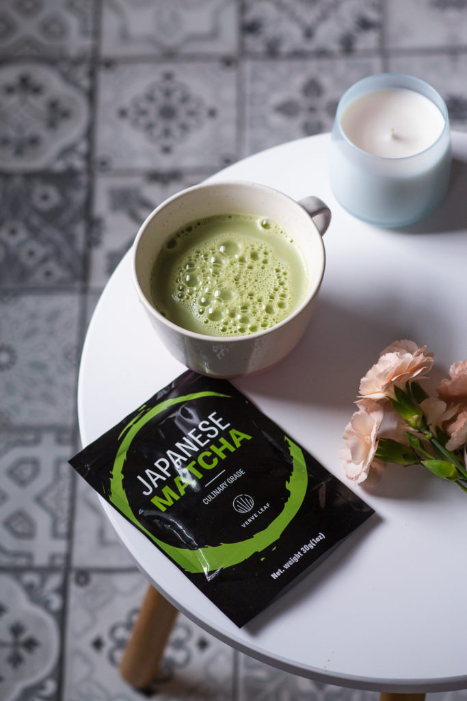
Whether you are shooting your own products or shooting for a client, you must be able to produce professional product images that will attract customers. Carefully planned and executed product styling will ensure that your images communicate brand values. Ideally, they will create a visual representation of a lifestyle that’s attractive to the brand’s ideal customer.
Plan Your Shoot
Before you get started, you need to be very clear on what you want to communicate and what elements of the brand you want to highlight. This means figuring out the product’s ideal customer: who they are, what they like, and where the images are going to be used. You or your client may not be very clear on those things, so you need to gather inspiration from images and social media accounts. Check out online presences from similar products to see what works and what doesn’t for your brand so you can start thinking about how to style the product.
You also want to make sure that you are putting forward the best features of the product. Think about what makes the product better or different, or what the competition doesn’t have. For example, if you shoot a bag, you will want to highlight all the pockets by having props sticking out of them.
Next, you will want to choose a theme to highlight the features and the uses of the product. For example, if you shoot cosmetics, you will probably want to think of a bathroom setting; if you shoot a product that is easy to take on the go, you might want to put together a travel theme; if you shoot a gourmet tea, you may want to create a coffee shop setting.

Choose Your Color Palette and Background
Colors are a very powerful tool in the photographer’s belt. When they are paired well, they can create beautiful and balanced visuals. But you have to think past the pretty picture: colors have powerful connections to emotions and feelings. A colorful and bright color palette will define a brand as happy and energetic. Pastel and muted colors will fit a more peaceful brand identity. Think about the emotions you want to create and start to think about a color palette. To make sure you are choosing colors that work well together, make sure to use Adobe Kuler. And if you are interested in learning more about color theory, check out this article from the official Canva blog.
Once you have decided on your theme and the feel of your images, you need to gather the background and props for product styling. They will be the supporting elements of your image and will help tell your brand’s story.
The background is extremely important so choose it carefully to reflect the brand. Think about the product and the values of the brand. Choose a background that fits them. For example, a marble background will convey a feeling of luxury; a natural wood background will evoke a rustic, natural, or maybe organic environment; a white background is a great fit for a minimalist brand. Put together a few backgrounds that can fit your brand’s aesthetics so you have options on your shoot day.
Choose Your Props
Once you have decided on a theme, color, and background, half of the work is done. Okay, maybe half of the prep work. 😉 It is now time to think about the fun part of product styling: your props. They should fit the theme and act as supporting elements to the overall story. Make sure your props aren’t too big compared to the product: you don’t want them to steal the show. The product MUST be the hero. Make sure they fit in with the color palette as well and are not too distracting in color or shape. Do not show any other brand or label. The product you are photographing should be the only branded item, otherwise you may confuse the viewer.
When styling a product, you want to place your props in a natural way so it doesn’t look too staged. Layer or stack your props to add dimension and interest. Place some props at the edge of the frame so that the viewer doesn’t see the whole object: it creates a feeling that there is more going on outside the frame. Don’t try to cover the whole frame: leave some negative space to create some breathing room and to allow the viewer’s eye to rest.
There is also a lot that goes into composing an image, which is a whole topic by itself. If you would like to learn more about it, check out Composition Essentials by Rachel Korinek, one of the most in-depth classes about composition out there.
Create a Scene and Add a Human Element
I like to hint the presence of a human in my images. It can be as simple as a cup of tea or coffee. I also like to include an open book or magazine sometimes (even better if it has people in it). You can be more obvious and add a hand to the frame, or use a full-on action shot.
My favorite part of product styling is creating scenes where viewers can imagine way past the frame. You can position your product to create the illusion that it is on a table, bed, or desk. Or “fake” a bathroom/kitchen shelf. You don’t have to actually have a kitchen in your studio to create this. A few backgrounds and a plank of wood will do it. A flat lay also leaves plenty of room for the eye to wander.
If you want to do more product photography and product styling, start creating a bank of props. My favorite props to use are:
- Plants – Fresh flowers (or silk flowers, some look really amazing), foliage, and succulents really brighten up a shot.
- Vintage Props – Old fashioned scissors are one of my favorite props. You can go to the antique store and pick old cooking utensils for your food shots. Old letters and stamps make great props for desktop flat lays, along with old vintage books, old vintage fabrics, etc.
- Knick Knacks – These are inexpensive and always useful: ribbons, makeup, glasses, office supplies, small jewels, magazines, your phone, notepads, notebooks, books, pens, pouches and purses, thank you cards, small trays and plates…anything can be a prop under the right circumstances!
- Creative Backgrounds – Foamboard, contact paper, wood boards (old pallets make great ones!), and vinyl backdrops (my favorites) are good starting points. Also look at what you have around your home: tissue paper, gift wrapping paper, brown paper bags (yes!!), parchment paper, newspapers, bed sheets, linens…so many options!
My Final Tip – Edit
Editing your images is incredibly important and can take them from okay to amazing. I recommend editing in Lightroom on your desktop to get the full capabilities. Lightroom is incredibly powerful, especially when you know how to use it. (Want to give it a shot? Check out all of my guides to Lightroom, starting with Lightroom for Beginners.) If you want to become a power user and get some amazing results, I suggest Rachel Korinek’s Lightroom Magic course. It has changed my editing forever!
-

Before Lightroom Magic -

After editing with Lightroom Magic
Pro-tip: when you edit your images, spend some time editing the product’s label. Make it a little bit brighter than the rest of the image, and up the clarity and vibrance. Your viewer’s eyes will go straight to the hero of the pictures and it will amaze your clients!
If you have questions about product styling or if you are looking for a photographer to shoot some amazing images of your products, contact me. I would love to hear from you! Be sure to follow me on Instagram and subscribe to my email list to get the best of what Frenchly has to offer.
Leave a Reply Cancel reply
| Created with Showit
| Design by Oregon Lane Studio
| Privacy Policy
© 2020 Frenchly Photography
Back to Top
THE WEBSITE
THE BLOG
Helping brands and businesses promote a happy, healthy and sustainable lifestyle through stunning food and product photography


Thank you so much for this post. I want to be a food photographer and work with food brands, and I loved the tips you shared !
Merci Sasha ! J’ai jeté un oeil à ton portfolio, et j’y ai vu de très jolies photos ! J’aime beaucoup tes madeleines et le shot du granola 🙂 A bientôt et fais moi signe si tu as des questions!